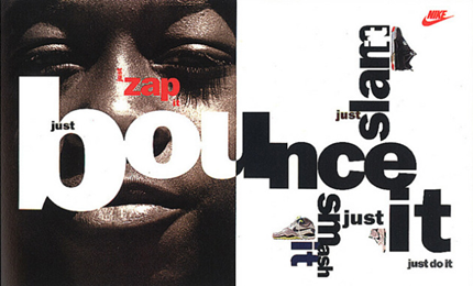
A Nike advert
designed by Neville Brody.This piece is iconic of Neville’s style and includes
all the features of his typical innovative designs. For me, this design is interesting due to the
use of different type, and the arrangement of the letters. The uneven alignment
of the letters, particularly in the word ‘bounce’ makes the text seem active
and playful, as though the letters are actually bouncing off the page. This
makes the advert fun and engaging and brings the text to life. It also works
very well for this advert specifically as it is for a sportswear company, and
it really brings out the message they are trying to convey.
I also like the use of colour included in the advert. The hint of bright red repeated across the pages make the colour, and the advert pop from the page. As red is a bold striking colour, the hint of red would be the first colour readers would instantly look at. Leaving the rest of the pages white and black enhances the effect of the colour. Another notable feature is the way he collaged the images together with the text across the double pages spread to make one cohesive piece, rather than just images to support the text. |

Neville Brody
is an English typographer, graphic designer art director. Brody has
consistently used visual communication in all media through his experimental
and challenging work, and continues to extend the visual languages used through
his exploratory creative expression. Neville Brody
started Graphic Design at London College of Printing in 1976. He began
experiments and produced typefaces that are widely known today. He also worked
as an art director for Face Magazine.
This is a creative typography design by Neville Brody. The piece uses unusual shapes and angular curves to create an interesting and engaging design. For me personally, this combined with the bold colours and black background, made it immediately catch my eye. The letters all look precise and smooth. The curves of the letters are somewhat angular and random, which adds an unconventional twist. This could also be trying to force the message of the text, ‘Free me from freedom’ as it is freeing the text from the conventional uniformity of type. The colours used are also usual as Neville Brody has combined a counterbalance of both bold and neutral colours. This helps make the piece more striking, whilst remaining pleasing to the eye. I particularly like the way he has spread the variation of colours in a random pattern. Overall I like the design of this piece as the typography is engaging, experimental and very expressive. |
